In 2015, I designed a responsive mobile web and web application called Lazy Oceans. This passion project allows the user to explore the cruise vacations offered by a fictitious company, search for trips, and book one.
In Brief
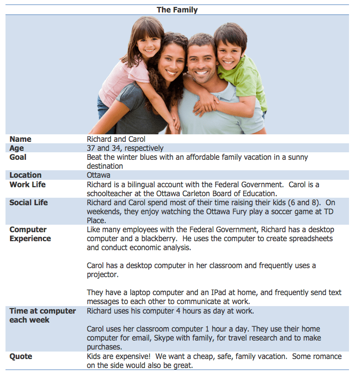
- After defining the general business model for Lazy Oceans, I developed a number of personas for the site, including one for Richard and Carol, a family with two kids.
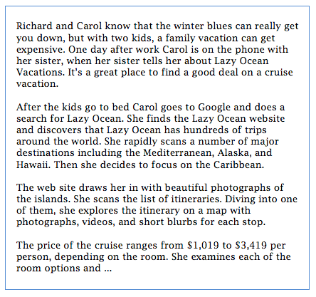
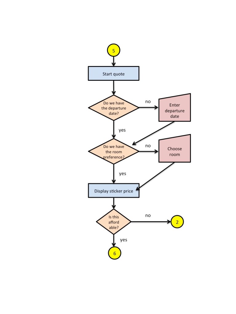
- I wrote a scenario, a brief story demonstrating how Carol will use the Lazy Oceans web site to find and purchase a cruise vacation. Then I drew an exhaustive scenario flow chart of the search, browse, quotation and purchase options on the Lazy Oceans web site.
- Starting with a mobile first approach, I sketched out a minimalistic mobile design on paper. Then I drew a rough sketch of the web site. I transferred the web design into Balsamiq and designed all of the screens for search, browse, quotation and purchase. Then I circled back on the mobile design.
- In September, just for fun, I implemented the front and back end using HTML5 and Bootstrap.js
Start with the user in mind
At the start of this course I developed a set of personas for the typical cruise ship customer. The personas were based upon my own experience as a traveller. In a professional role I would conduct user research, or harness the knowledge of my product manager to seed the persona.
After developing the personas I went on to write a simple scenario. This can be used by the design or development team to get a quick overview of the site purpose and target experience. Here are the first few paragraphs of the scenario.
Map out the user journey
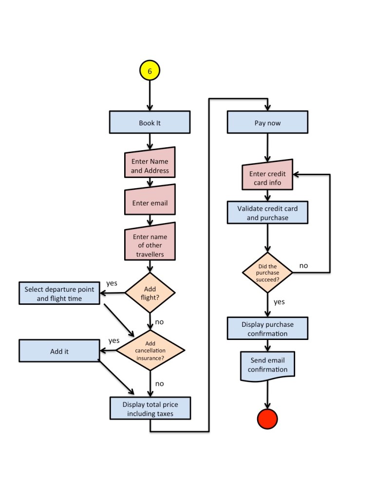
I also drew an exhaustive scenario flow chart, covering search, browse, quotation and purchase. This is an excellent springboard for design, because each branch and each step within the flowchart can be converted into information architecture, workflow, and interaction design.


Sketch out the mobile experience first
The initial design for the site was created using pen and paper. It’s a great way to sketch out ideas quickly, but I quickly turned to Balsamiq after that.
I’m a strong believer in mobile first design. The small form factor forces a designer to focus on the key scenario and features, and drop or de-emphasize secondary features. With that in mind, I sketched out a rough mobile design, and then turned to the web experience. I followed up with the full mobile experience.
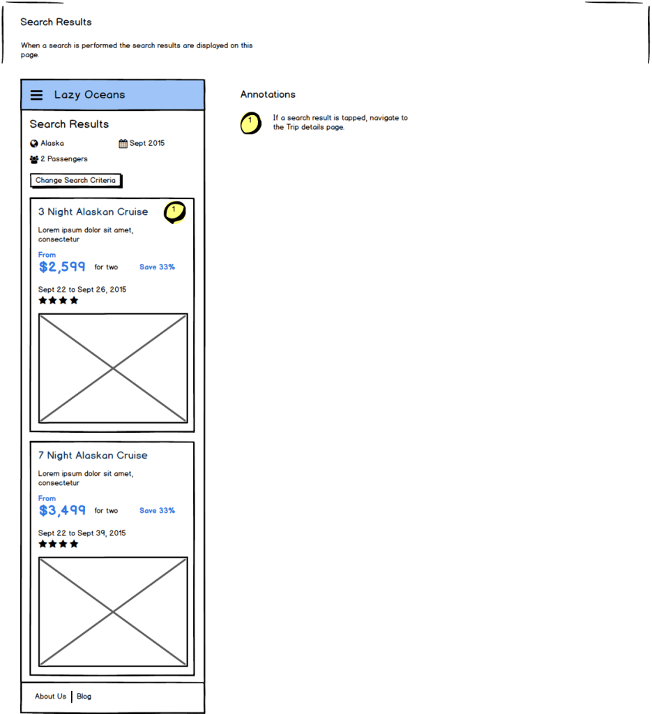
Here are some snapshots from the mobile web design.


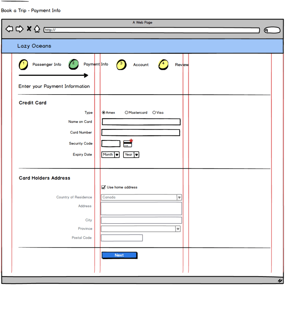
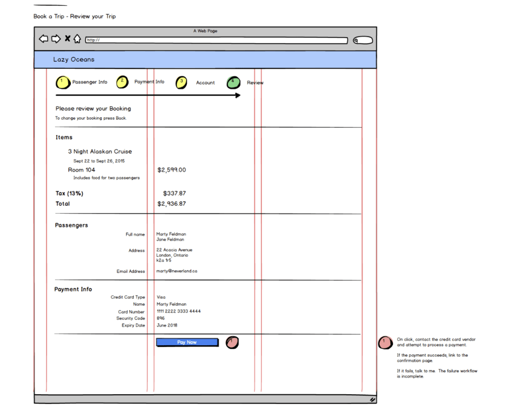
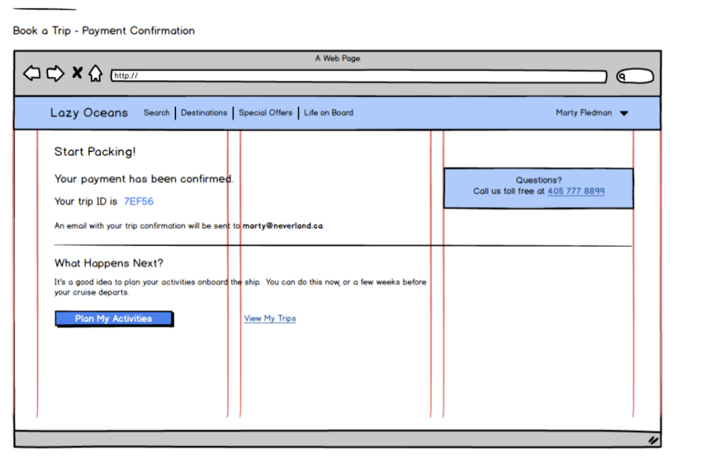
Sketch out the web design second
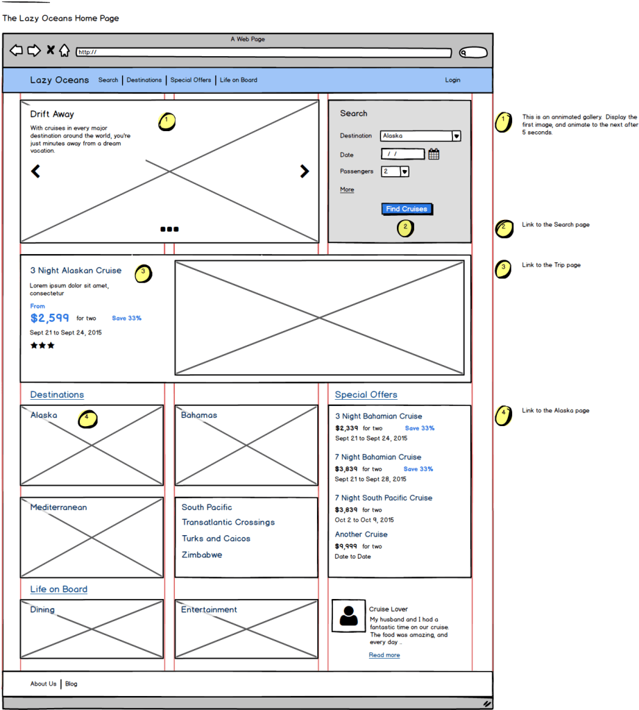
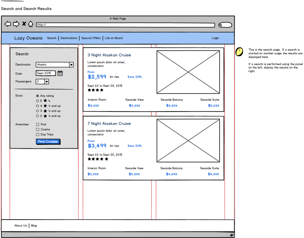
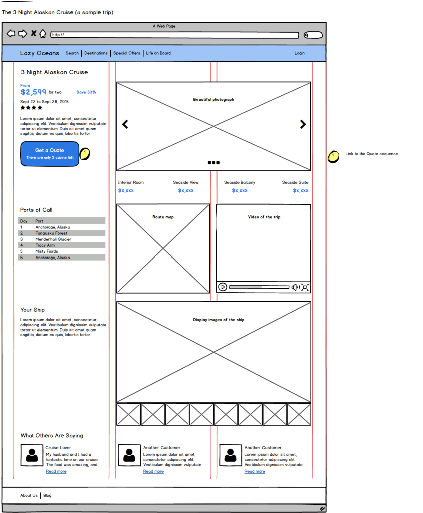
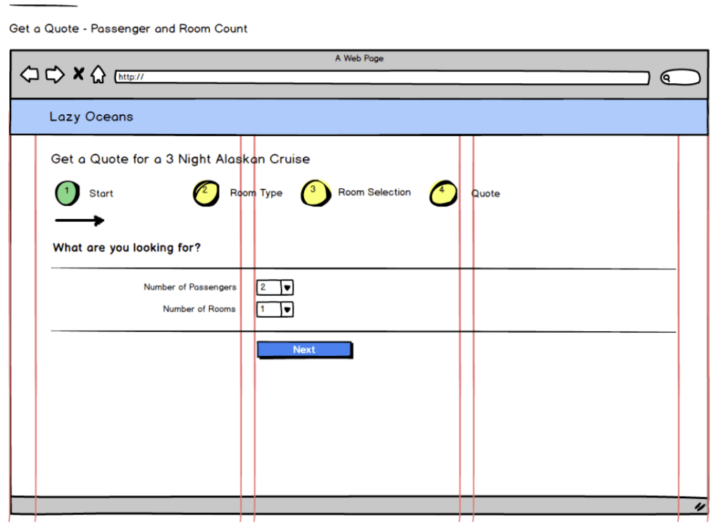
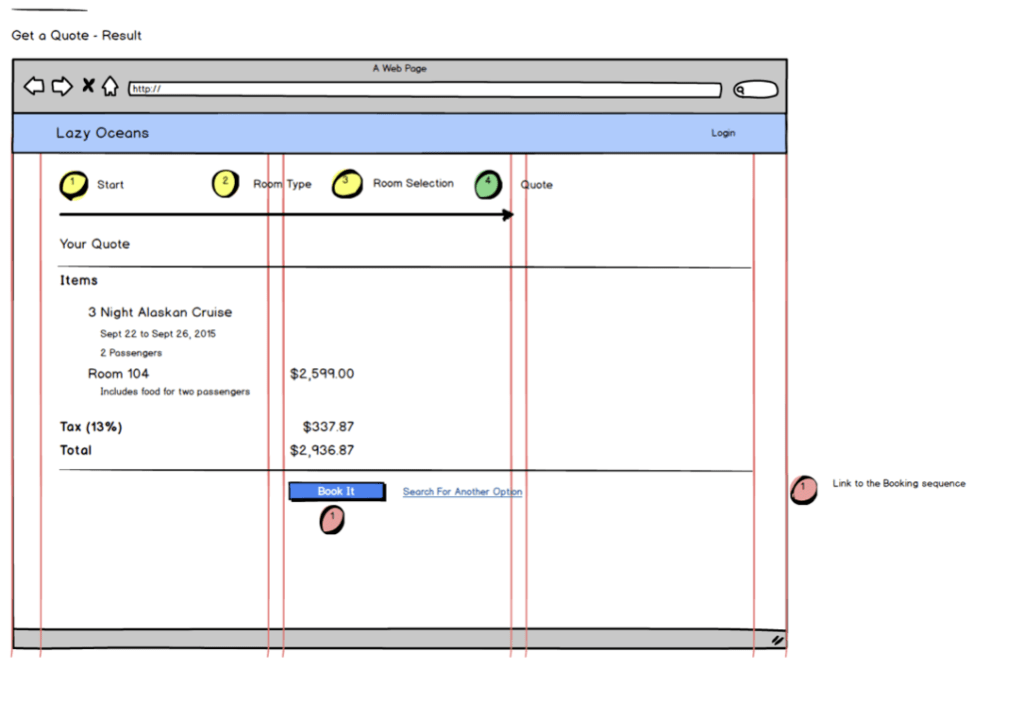
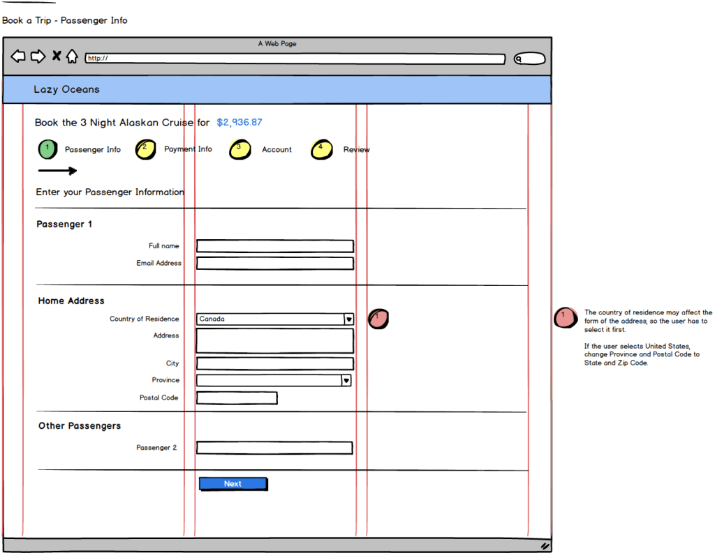
Here are some snapshots of the web design.

 Dave Springgay