I ran my first Google style design sprint in early 2017. We used this exercise to redesign Trip Buddy, a component in the Zoomcar app that helps the customer pickup, drive and return their car during a booking.
Sprint Structure
- Day 1: Analyze the problem and prioritize the requirements
- Day 2: Embrace divergent thinking. Sketched about 50 wild and crazy ideas, mix em up, and sketch some more.
- Day 3: Converge on a single direction.
- Day 4 and 5: Create a clickable prototype.
- Day 7 and 8: Conduct a usability testing.
- Much later: Create the first high fidelity design
Day 1 – Identify the problem you’re going to solve
In preparation for the sprint we assembled a team from product management, development, design, and other customer facing roles.
On the first day we analyzed the problem statement. We were asked to redesign the app you use when you pick up a rental car from Zoomcar, drive it, and return it. There was a huge spreadsheet of requirements, so we had to prioritize them by frequency and impact. This helped us determine which ones we would consider in the sprint.
Day 2 – Sketch out some crazy ideas
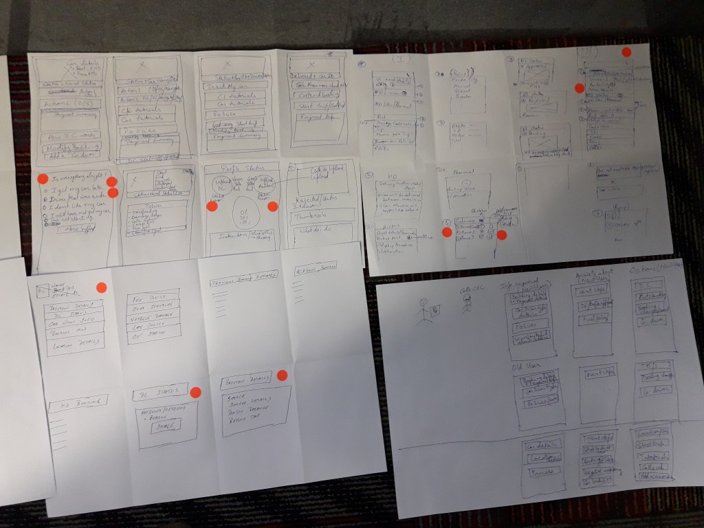
On the second day we asked 10 people to sketch out their ideas. A lot of good ideas came out, but the group was large, so we split it into two, and asked each group to focus on a different part of the experience. This may have reduced the opportunity for cross pollination.


Day 3 – Converge on a direction
On the third day we attempted to converge on a direction. During this period each person produced a solution sketch. This is essentially 3 to 5 sketches, showing the flow of screens in a scenario. We presented these in an art gallery, and then did a speed critique on each to review and share ideas.

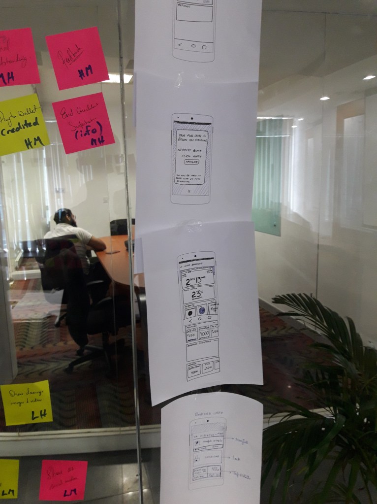
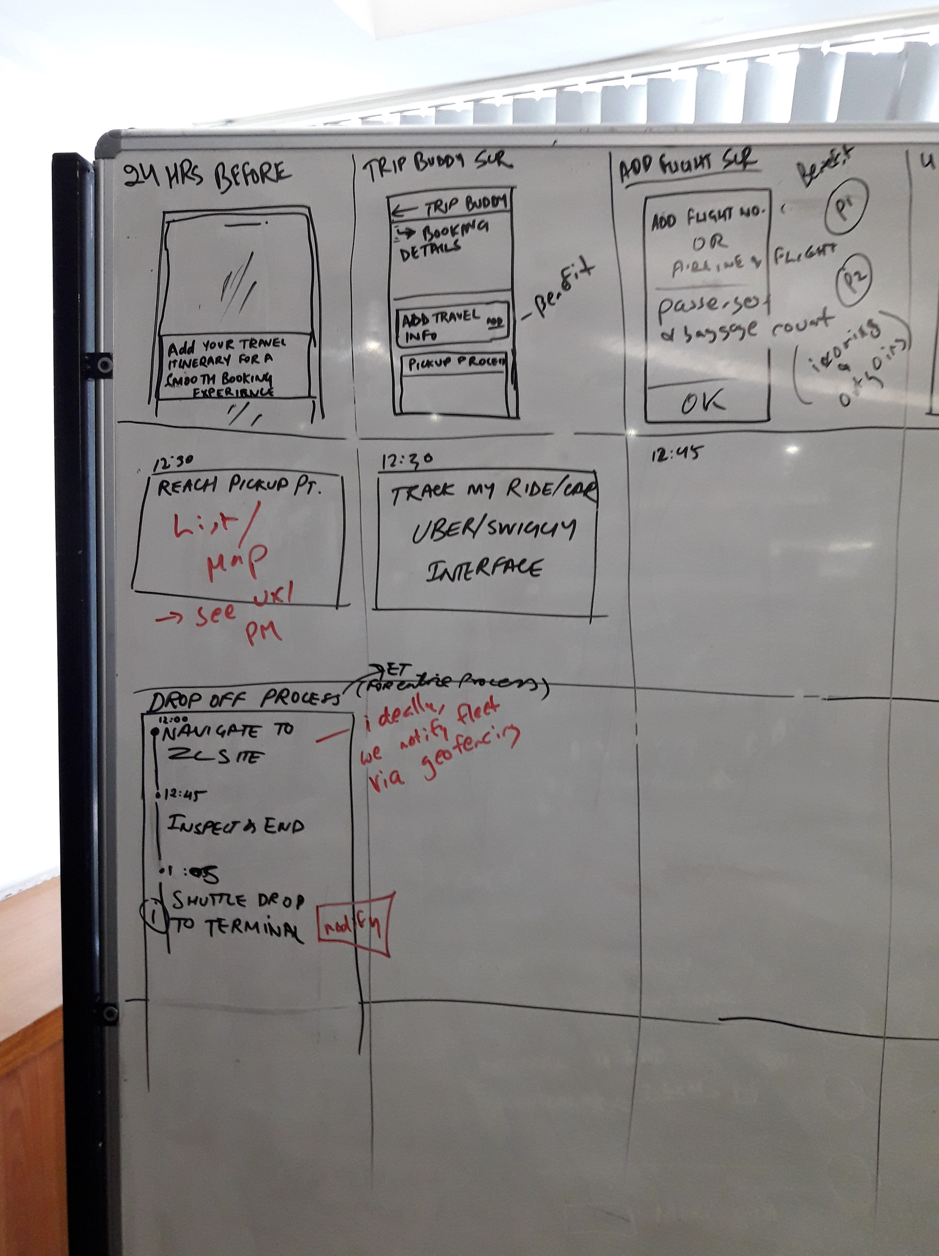
At the end of the third day there were 3 competing ideas. Unfortunately, we didn’t have a decider, so we spent the next day sketching out a story board for each on a whiteboard. But by the end of the third day we voted 9 to 1 for a card based direction. Here’s a partial snapshot.
Day 4 – Create a prototype
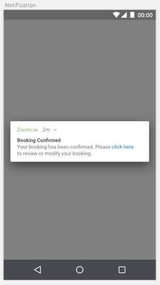
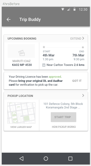
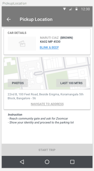
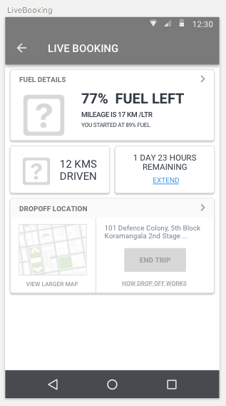
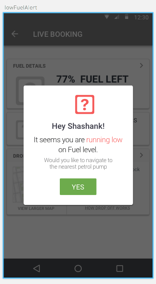
It took us two days to produce a prototype. We created the screens in sketch, uploaded them into marvel, and added hot spots. There were about 25 screens in the prototype. At this point in time the wireframes were very rough, but the purpose of the test is to find usability problems, not produce a beautiful product.

Day 7 – Test
It took us another day to prepare for the test, and two days to run it with 5 people. This was the first usability test for the team, so we spent a lot of time developing the infrastructure for mobile screen sharing.
On the day of the test we rotated through the role of moderator. That was challenging, because two of us stuck to the script, and the third tended to veer off and argue with what the participant said. But it was a good start for a team new to testing.
On the final day we met with the stakeholders to discuss the results and present next steps. The test demonstrated that the direction was usable, but there were about 20 issues that needed to be addressed. We addressed the problems and went on to look at the visual design.
Much later – high fidelity
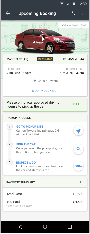

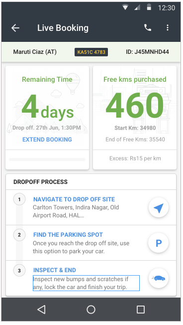
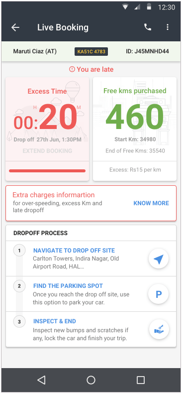


In retrospect, it took us two weeks to get to a design which we can move for reward with. We were successful, but I think the original problem was too large. There are also plenty of places where we can make improvements to our execution.

Leave a comment