As a senior UX architect for IBM Business Analytics, I set the direction for many new features in Planning Analytics and Cognos Analytics, and then worked closely with other designers to sweat the details.
My Role
- Lead and mentor over a dozen designers and user researchers
- Simplify the overall UX for IBM’s business analytics products
- Help novice and experienced users achieve their goals easily.
- Collaborate with senior product management, to ensure business needs are met.
- Ensure we have an intuitive, seamless, consistent look and feel across the portfolio
Sample Outcomes
- We redesigned the product home pages, making it easier for trial and paid uses to get started
- Reduced plan creation time by 90%
- Added support for complex planning in large organizations with 100’s or 1000’s of people
- Designed the mobile response for dashboards on mobile and tablet devices
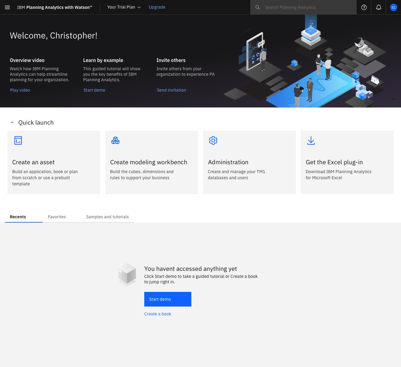
Make it easy to get started
In Planning Analytics and Cognos Analytics we made it easier for novice users to get started by designing a common home screen, where getting started information is displayed across the top and then actions are provided to create the most important assets in the product.
We also made it easier for returning users to get started by displaying the assets they use frequently below, so they can just click on them and return to work.
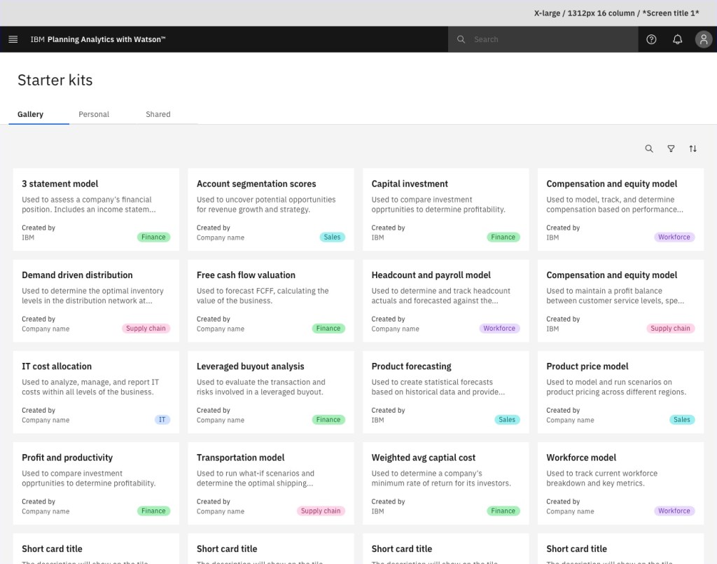
Create a new plan in minutes, not weeks
In Planning Analytics it has historically taken weeks or months to produce a viable plan. This discourages smaller companies from signing up to the product.
In order to reduce this startup time, a senior designer and I designed a catalog of starter kits and the UX to leverage them. After selecting a starter kit, the user is asked to customize the key elements and make the starter their own. This made it possible to create a new plan in minutes and then take it for a spin.
Launch a planning cycle across 100’s of people
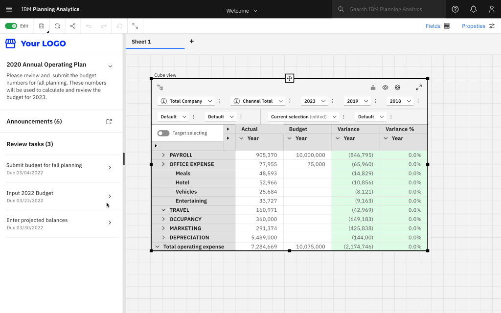
In Planning Analytics you can create a financial plan and share it with 100’s of people across an organization. In 2021 a senior designer and I designed a new feature, making it possible for those people to contribute data directly to the plan in a series of steps. Once a contribution has been made, another person can be assigned to review, approve, or reject the contribution.
This feature filled a huge gap in Planning Analytics, and makes it easier than ever to create a top down or bottom up plan across your organization. In the snapshot below, you can see how the steps in the plan are defined.
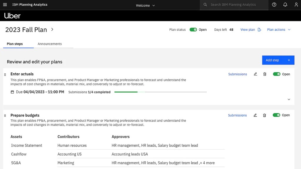
The individual contributors have their own view of the plan, where the instructions are displayed, and they contribute directly into opens areas of the planning table.
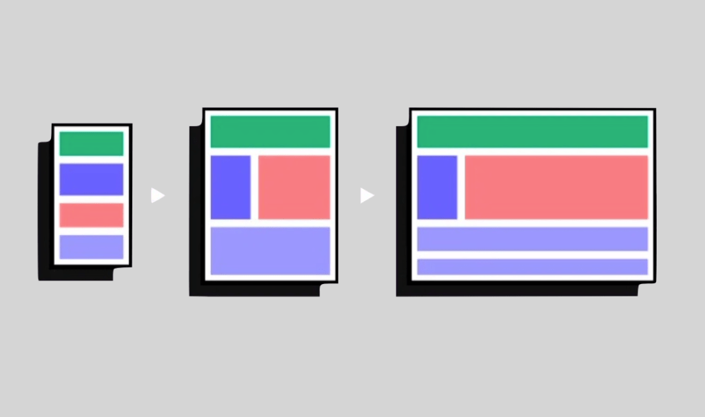
Render your dashboards across mobile, tablet and desktop
In Cognos Analytic you can visualize data using a dashboard. The layout of this dashboard has historically been defined using XY coordinates, making it difficult to consume on a tablet or phone.
In 2022 my colleague Warren and I started to explore how we could make it easier to build a dashboard which would work on mobile and tablet devices. In this case, Warren was the inspiration, and I provided frequent advice, feedback, and sponsorship.
We solved this design challenge by introducing responsive layouts. The layout of a dashboard is defined by a series of columns and rows which automatically adapt to the available screen real estate. The gutters, margins and font sizes are also calculated automatically, so it’s almost impossible for a novice user to create a dashboard which looks or responds poorly.
In order to champion this idea, we created some sketches and then met with product management and development many times. We pushed the idea from conception to design, design to prototype, prototype to plan, and plan to development.